When Tableau announced #VizAsArt a Data Visualization Art contest, I was thrilled and decided
to participate in the contest. These are the two reasons why I decided to participate;
- Data contests are fun and a good way to learn. This is how I actually got hooked onto Tableau with my first data visualization RunViz
- I have an eye for the art and design, but was never good with my hand to create any art. Well with Tableau, as always, there are no excuses and thought to give it a shot.
In a typical
data analysis project, data analysts will have the data and set of questions to
answer or discover something from the data. Whereas, in a #VizAsArt projects,
typically there are no requirements and all we have is the data and a White
Canvas. Coming up with a non-functional art was challenging, but trust me it
was fun and worth it.
How I came up with the “Emerald City”
idea?
Idea
for the “Emerald City” came to me while I working on a Customer Survey Project at work. Was looking to build a view to see the number of surveys done by channel and by the quarter. Dragged QUARTER (Date) continuous measure on to the column
shelf, survey channel on to the row shelf, number of records to the color
shelf, and QUARTER (Date) continuous to the Size shelf. The view ended up like
below.

To make the marks appear clearly without overlapping, I reversed the size legend and the
view ended up as below.

This looked
to me like a sleeping Sears’s tower (or we call it Willis tower now).
Immediately, my Tableau and artistic bulbs went off and my right brain was
going crazy. I swapped Rows and Columns and it really looked like a building.

That was the idea behind the Emerald City and really had no clue on how this would end up or look as the final product, I put on my construction hat on started to work.
That was the idea behind the Emerald City and really had no clue on how this would end up or look as the final product, I put on my construction hat on started to work.
Emerald City Under Construction
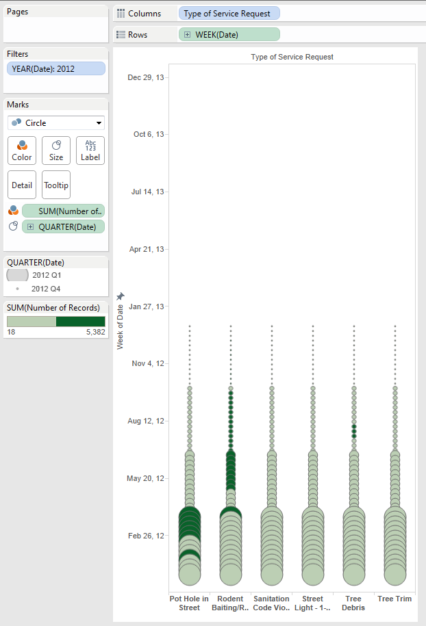
Dragged ‘Type
of Service Request’ on to column shelf and ‘Week (Date)’ continuous on to row shelf,
Number of records to color shelf, and finally Year (Date) discrete pill onto
the size shelf to get a stacked bars. For the #VizAsArt contest, we were limited to use
only four colors, so I changed the color pill to stepped colors and with two
colors.

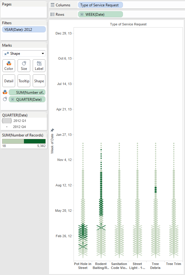
I wanted to
see how my building would look if I changed the Year (Date) to Quarter (Date) on
the size shelf, BOOM! another building structure as below. Saved this as
another sheet.

By
changing mark types to circle creates a sheet. With mark type as Shape and with different types of shapes, and varying the Date on the
size shelf to months, weeks, hours, etc. I ended up creating quite a few buildings, towers, etc.
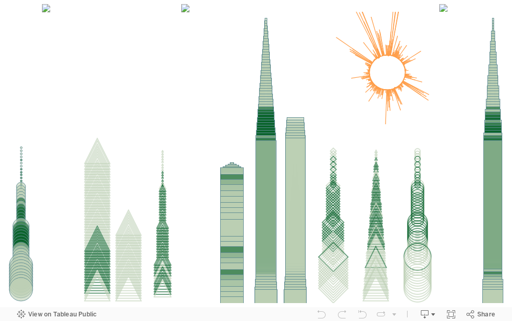
No two buildings are of the same height, filtered out some of the data randomly from some sheets and/or increase/decrease the axis in the other to get that effect. Now that we have few worksheets, played with the column filtering and kept one or two buildings on each worksheet, so when they are placed on the dashboard, adjacent buildings will not look the same. There you go...

Felt like
something was missing from the art (remember I told you that I have an eye for
the art), decided to add Sun to which would complete the art.
I am deeply
thankful to Dave Hart from InterWorks, EU for his Radial Bar Chart technique which
I used to create the Sun. Check out his blog on how to create radial
bar charts in Tableau.
Sun gave the finishing touch and I felt my #VizAsArt was complete.
Wait, every artwork should have a name and as the default color was green for the measures, I decided to call it “Emerald City”.
 Hope you
like my art and I am sure you are ready to build your own towns, cities, skyscrapers,
etc.
Hope you
like my art and I am sure you are ready to build your own towns, cities, skyscrapers,
etc.
P.S I am already thinking about this year’s “Seasons greetings cards”. Star shapes make a nice Christmas tree :)
Disclaimer
The City of Chicago ("City") does not endorse, sponsor, or
provide preferential treatment to, any third-party websites or persons or other
entities associated with third-party websites. The City does not control
third-party websites and, therefore, does not warrant that third-party websites
are accurate or reliable or have operational links. By selecting a link to a
third-party website, users leave cityofchicago.org and become subject to the
terms of use, privacy, and security policies of the owners/sponsors/operators
of the third-party website. By selecting a link to a third-party website, users
release the City from any liability for any injury to any person or property
caused by the user's or users' accessing a third-party website via a link on
the City's website.
Using the Chicago 311 data from years 2012 and 2013.


